Before I get into the tutorials I have to put in a plug for Society of American Miniaturists (S.A.M.). SAM is the non-profit organization I belong to that held the event where we made the Antique Shop. S.A.M. is dedicated to furthering the miniature dollhouse hobby. For a very small yearly fee ($15) a member may attend a FREE full day workshop which includes:
- the project structure
- a few smaller kits which we assemble during the day AND
- a bag of Tote Bag favors to go along with the theme
- Oh, yeah! And lunch (and birthday cake)!
The tote bag favors are donated and made by some of the approx. 150 members of the organization who each make 100 of the same item to go into the tote bags. This event funded by yearly dues and the generosity of the members who want to bring more people into the hobby by offering a fun, free event to all members. (P.S. Membership is OPEN! - see the website, www.minisam.org) If you want to see some of the lovely Antique Shops made by the event committee click here.
Back to the tutorials!
These are not in-depth tutorials - just description of how I modified a bookcase that was part of the S.A.M. Antique Shop project and how I made a skirted table to sit in front of the display window.
Bookcase
The bookcase was designed and cut out by the talented ladies of the Houston and surrounding area clubs who hosted the event. It must have been difficult to cut out 100 of these because each arch was a triple arch and the wood was kind of thick. Here is what it looked like before I embellished it:I added the vertical trim strips - just some kind of door or window frame molding (commercial). To make the upper arches look somewhat carved or appliqued I glued on pieces cut from a cheap paper doily:
After painting and glazing with diluted Burnt Umber acrylic it looked like this:
Skirted Table:
I needed something to sit against the display window and hold some items while not taking up too much room inside the box. My solution was to make a semi-circular (sort of) shaped table from stacked pieces of ceiling tile. Many years ago I took a workshop from Judee Williamson and Nicole Walton-Marble and they used ceiling tile to make chair forms. The ceiling tile is about 3/4 of an inch thick (?) from Home Depot or similar stores. I cut them out on the scroll saw then glued them together and sanded them. I needed a little extra height so I topped it off with a piece of foam core. In the foreground are two table tops I cut with the scroll saw then routed an edge using a pin router made from a dremel tool. I learned this from a class taught by Tom Walden (awesome class if you ever get a chance to take from him!). I made two because I was unsure of my ability having only done this in his class prior to this project.
The table form was painted with Gesso and small beads added for feet. Feet are needed so that if the skirt is uneven (which it will be) the white ceiling tile won't be visible at the bottom.
I pleated my skirt on the Pretty Pleater, skipping over two rubber ridges then over one, etc. Makes for a more natural looking (less perfect) skirt. I ironed a strip of fusible interfacing across the top to keep the pleats (will be cut off later).
Gluing on the pleated skirt - (tons of glue spread all over the table sides). I didn't take a photo of how I kept it against the table but I wrapped rubber bands around it near the top and let it dry.
After sides were dry I folded it over the top and clipped and removed a lot of bulky gathers before gluing:
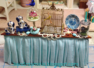
Here is how it looked after gluing on the table top (with some lovely items made for me by my friend Karen Haggard).
Here is the table viewed from outside the window. You can't really see the table from the outside. It is just the right height and just as wide as the window so that lots of little things can be displayed up close to the window. The first two photos below were my trial and error of deciding what should go in the window. The last photo is the arrangement of accessories that I finally decided on.
Kind of an Easter-ish theme with blue eggs (as in the store sign):
Final arrangement - more blue items were chosen to go along with the "Blue Egg" theme and colors of items inside the shop.
Hope to show some more Antique Shop photos - interior shots in my next blog.


Wow your shop is amazing. I love the pretty colours. Thanks for sharing how you made the table it is beautiful. I love all the tiny items on the table. The tiny house display with the blue bird is gorgeous.
ReplyDeleteHugs Maria
Kendra,
ReplyDeleteYour shop is so appealing and beautiful. Love the colors and the name.
Denise
Beautiful! Thank you for sharing.
ReplyDelete